A bell curve is one of the most common ways to understand how data is distributed. Teachers use it to adjust exam scores, researchers use it to analyze results, and businesses use it to measure performance. If you know how to calculate a bell curve, you can better understand whether scores are above average, below average, or close to the middle.
While you can calculate a bell curve by hand, the process takes time and requires several mathematical steps. If you want fast and accurate results, you can use our Grade Curve Calculator to calculate grade curves instantly.
In this guide, you will learn how to calculate a bell curve step by step using simple formulas and examples.
What Is a Bell Curve?
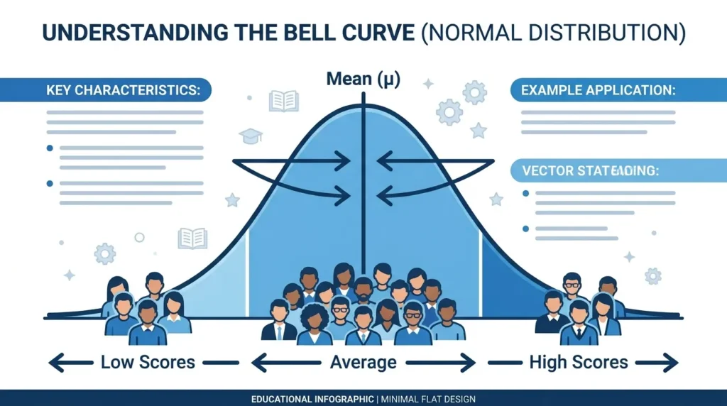
A bell curve is a graph that shows how data is spread around an average value. It is also called a normal distribution because most values are close to the center, while fewer values appear at the high and low ends.
The graph looks like a bell. The highest point represents the average value, and both sides gradually slope downward.
A bell curve has three important parts:
- Mean (Average)
- Standard Deviation
- Normal Distribution
The mean is the center of the data. Standard deviation tells you how spread out the values are. Together, they create the familiar bell-shaped curve.
For example, if most students score between 70 and 80 on a test, those scores will appear near the middle of the curve. Very low and very high scores appear near the ends.
When Should You Calculate a Bell Curve?
A bell curve is useful whenever you want to understand how values compare with one another.
Common examples include:
- Exam grading
- University classes
- Employee performance reviews
- Scientific research
- Survey results
- Manufacturing quality control
- Data analysis
Teachers often use a bell curve to adjust grades when an exam is unusually difficult or easy. Businesses use it to compare employee performance fairly. Researchers use it to understand patterns in collected data.
What You Need Before Calculating a Bell Curve
Before you begin, gather the following information:
- A list of data or scores
- The total number of values
- A calculator or spreadsheet
- The mean (average)
- The standard deviation
For example, imagine these exam scores:
72, 75, 80, 82, 78, 69, 85, 77, 74, 81
These scores will be used to calculate the bell curve.
How to Calculate a Bell Curve Step by Step

The calculation becomes much easier when you break it into small steps.
Step 1: Collect Your Data
Start by writing down every value in your dataset.
Example:
| Student | Score |
|---|---|
| A | 72 |
| B | 75 |
| C | 80 |
| D | 82 |
| E | 78 |
| F | 69 |
| G | 85 |
| H | 77 |
| I | 74 |
| J | 81 |
Always check that your data is complete before doing any calculations. Missing scores can change the final result.
Step 2: Calculate the Mean
The mean is simply the average of all values.
To calculate it:
- Add every score together.
- Divide by the total number of scores.
Example:
72 + 75 + 80 + 82 + 78 + 69 + 85 + 77 + 74 + 81 = 773
Number of students = 10
Mean = 773 ÷ 10
Mean = 77.3
This value becomes the center of your bell curve.
Step 3: Calculate the Standard Deviation
The standard deviation measures how far each value is from the average.
If most scores are close to the mean, the bell curve will be narrow.
If scores are spread out, the bell curve will be wider.
To calculate standard deviation:
- Find the difference between each score and the mean.
- Square each difference.
- Add all squared values.
- Divide by the number of values (or one less for sample data).
- Take the square root.
For our example, the standard deviation is approximately:
4.7
This tells us that most scores are within about five points of the average.
Standard deviation is one of the most important parts of a bell curve because it determines the shape of the distribution.
Step 4: Calculate the Z-Score
Once you know the mean and standard deviation, you can calculate the z-score for every value.
The z-score shows how far a score is from the average.
The formula is:
Z = (Score − Mean) ÷ Standard Deviation
For example, suppose a student scored 82.
Mean = 77.3
Standard deviation = 4.7
Z-score
= (82 − 77.3) ÷ 4.7
≈ 1.00
A positive z-score means the score is above average.
A negative z-score means the score is below average.
A z-score of zero means the score is exactly equal to the average.
Calculating z-scores makes it easier to compare different datasets fairly.
Step 5: Plot the Bell Curve
After calculating the z-scores, you can create the bell curve.
The center of the graph represents the mean.
Scores close to the average appear near the highest point.
Scores farther from the average move toward the left or right side.
The graph should look balanced if your data follows a normal distribution.
Many teachers and researchers use graphing software to create the curve, but modern online calculators can generate it instantly.
If you want to skip manual plotting, try our Grade Curve Calculator, which automatically creates a grade distribution chart after you enter your scores.
Bell Curve Calculation Example
Let’s use a simple classroom example.
Student scores:
69, 72, 74, 75, 77, 78, 80, 81, 82, 85
Step 1: Calculate the average.
Average = 77.3
Step 2: Calculate the standard deviation.
Standard deviation ≈ 4.7
Step 3: Calculate the z-score for each student.
Each score is compared with the average.
Step 4: Plot the results.
The graph shows most students near the center, with only a few students at the highest and lowest scores.
This is a good example of a normal distribution because the scores are fairly balanced around the mean.
When working with larger classes, manual calculations become much slower. An online calculator can complete the same process in seconds while reducing the chance of calculation errors.
How to Calculate a Bell Curve in Excel
Microsoft Excel makes bell curve calculations much easier.
First, enter your scores into one column.
Use the AVERAGE() function to calculate the mean.
Next, use STDEV.P() for population data or STDEV.S() for sample data.
After finding the standard deviation, use the NORM.DIST() function to calculate values for the normal distribution.
Excel can also create charts that help you visualize the bell curve. This method is useful for teachers, researchers, and analysts working with large datasets.
How to Calculate a Bell Curve in Google Sheets
Google Sheets offers many of the same functions as Excel.
Enter your data into a column and calculate the average with AVERAGE(). Then calculate the standard deviation using STDEV.P() or STDEV.S(). Finally, use NORMDIST() or related statistical functions to generate values for the bell curve.
Since Google Sheets works online, it is a convenient option for teams and educators who collaborate on shared spreadsheets.
Calculate a Bell Curve Online
If you do not want to perform every calculation by hand, you can use an online bell curve calculator. This is the fastest way to analyze grades and generate accurate results without using complex formulas.
Our Grade Curve Calculator helps you calculate grade curves in just a few steps.
Simply:
- Enter or paste your student scores.
- Choose your preferred grading method.
- Review the adjusted scores instantly.
- View the grade distribution chart.
- Download the results as a CSV file if needed.
This approach is especially useful for teachers who grade multiple classes or anyone working with large datasets.
Manual Calculation vs. Bell Curve Calculator
You can calculate a bell curve manually or use an online calculator. Both methods produce similar results, but they differ in speed and convenience.
| Manual Calculation | Online Bell Curve Calculator |
|---|---|
| Takes more time | Calculates instantly |
| Multiple formulas | Automatic calculations |
| Easy to make mistakes | Reduces calculation errors |
| Better for learning | Better for everyday use |
| Difficult for large datasets | Handles hundreds of scores easily |
| Requires plotting graphs manually | Creates charts automatically |
Learning the manual process helps you understand how a bell curve works. However, for regular grading and data analysis, an online calculator is usually the better choice.
Common Mistakes When Calculating a Bell Curve
Even a small mistake can change your final results. Here are some common errors to avoid.
Using the Wrong Mean
Always double-check your average before moving to the next step. If the mean is incorrect, every other calculation will also be wrong.
Choosing the Wrong Standard Deviation Formula
There are two common formulas:
- Population standard deviation
- Sample standard deviation
Using the wrong one can produce slightly different results. Make sure you know which formula matches your dataset.
Entering Incorrect Data
Review your scores before calculating the bell curve. Missing values, duplicate entries, or typing errors can affect the final distribution.
Assuming Every Dataset Forms a Bell Curve
Not all data follows a normal distribution. Some datasets are skewed because of outliers or unusual patterns. If your graph is not symmetrical, it may not represent a true bell curve.
Forgetting to Calculate Z-Scores
Z-scores show how each value compares to the average. Skipping this step makes it difficult to understand where each score falls within the distribution.
Tips for Accurate Bell Curve Calculations
Follow these best practices to improve your results.
Organize Your Data
Arrange your values in a spreadsheet or list before starting. Clean data leads to more reliable calculations.
Verify Your Mean
After calculating the average, check it again before moving to the standard deviation.
Use Reliable Tools
Excel, Google Sheets, and online calculators help reduce human error. They also save time when working with many scores.
Check for Outliers
Extremely high or low values can affect the shape of the bell curve. Review your dataset to see whether these values are expected.
Compare Your Results
If you calculate the bell curve manually, compare your answers with an online calculator. This helps confirm your calculations are correct.
Why Teachers Use Bell Curves
Many instructors use bell curves to make grading more balanced. If an exam is much harder than expected, raw scores may not accurately reflect student performance.
For example, if most students score between 50 and 60 on a difficult test, a teacher may adjust the grades using a bell curve. This shifts the score distribution while keeping the ranking between students consistent.
Bell curve grading is also useful when comparing students across different sections of the same course.
If you want to learn more about how curved grading works, read our guide on What Is a Grade Curve?.
You can also compare different grading methods in our article about Bell Curve vs. Linear Curve.
Benefits of Using a Bell Curve Calculator
A bell curve calculator simplifies the entire process by performing all calculations automatically.
Some of the biggest benefits include:
- Saves valuable time.
- Reduces mathematical errors.
- Calculates averages and standard deviations automatically.
- Supports different grade curve methods.
- Creates clear grade distribution charts.
- Allows CSV export for record keeping.
- Suitable for classrooms, colleges, universities, and businesses.
Instead of spending time performing calculations manually, you can focus on interpreting the results and making informed decisions.
When Should You Use Manual Calculations?
Although online calculators are faster, manual calculations are still valuable in certain situations.
You should calculate a bell curve by hand if you are:
- Learning statistics for the first time.
- Preparing for an exam.
- Teaching students how normal distributions work.
- Checking the accuracy of software results.
Understanding the mathematics behind a bell curve helps you interpret the results more confidently, even if you later switch to an automated tool.
Conclusion
Learning how to calculate a bell curve helps you understand how data is distributed around an average. Whether you are grading exams, analyzing survey results, or evaluating employee performance, the process follows the same basic steps.
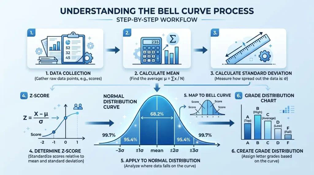
Start by collecting your data, calculate the mean, determine the standard deviation, compute the z-scores, and plot the results to create the bell-shaped distribution. While these calculations are useful to learn, they can become time-consuming for larger datasets.
If you want a faster and more accurate solution, try our Grade Curve Calculator. It automatically calculates bell curves, adjusts grades using multiple curve methods, generates interactive distribution charts, and lets you export your results in seconds. Whether you’re a teacher, student, researcher, or data analyst, it makes bell curve calculations simple, accurate, and efficient.